
Application Design
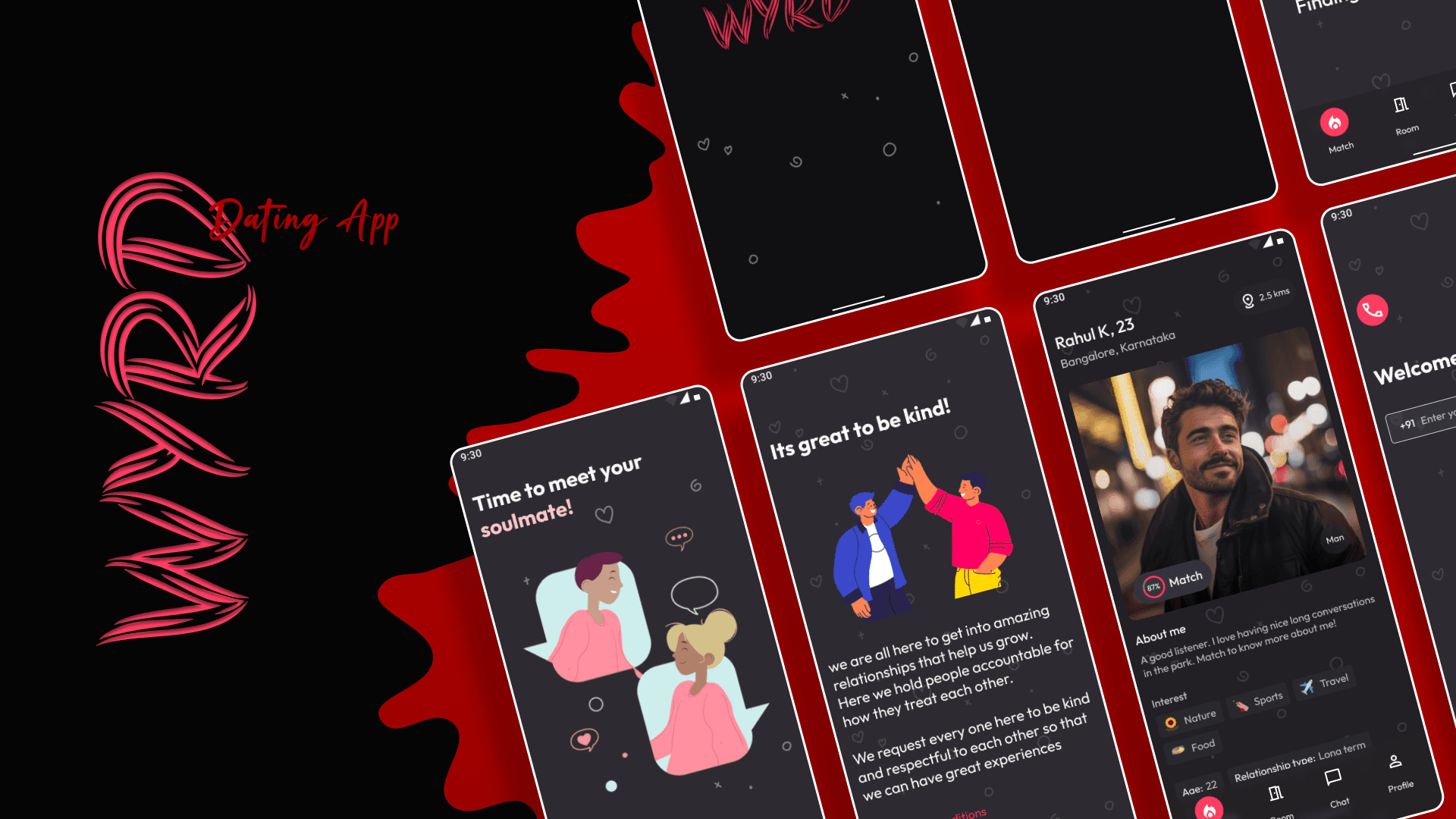
WYRD Case Study
Crafting an intuitive and fun experience that turns first impressions into deeper connections.
Live Link: WYRD Project
Project Overview
Goal: WYRD is a dating app concept focused on enabling authentic conversations. Our task was to design a UX that feels playful, engaging, and seamless.
Role: UX/UI Designer
Tools: Figma, Illustrator, Photoshop (adjust per project)
Duration: 3 weeks
The Challenge
Dating apps often overload users with features, resulting in a steep learning curve and high early drop-offs. WYRD aimed to be different—keeping the flow minimal while making the user experience engaging and human-centric.
Our Process
1. Research & Insights
Competitor analysis of top dating apps
User interviews with 15 participants (ages 22–35)
Identified top frustrations: long onboarding, irrelevant matches, lack of conversation sparkers
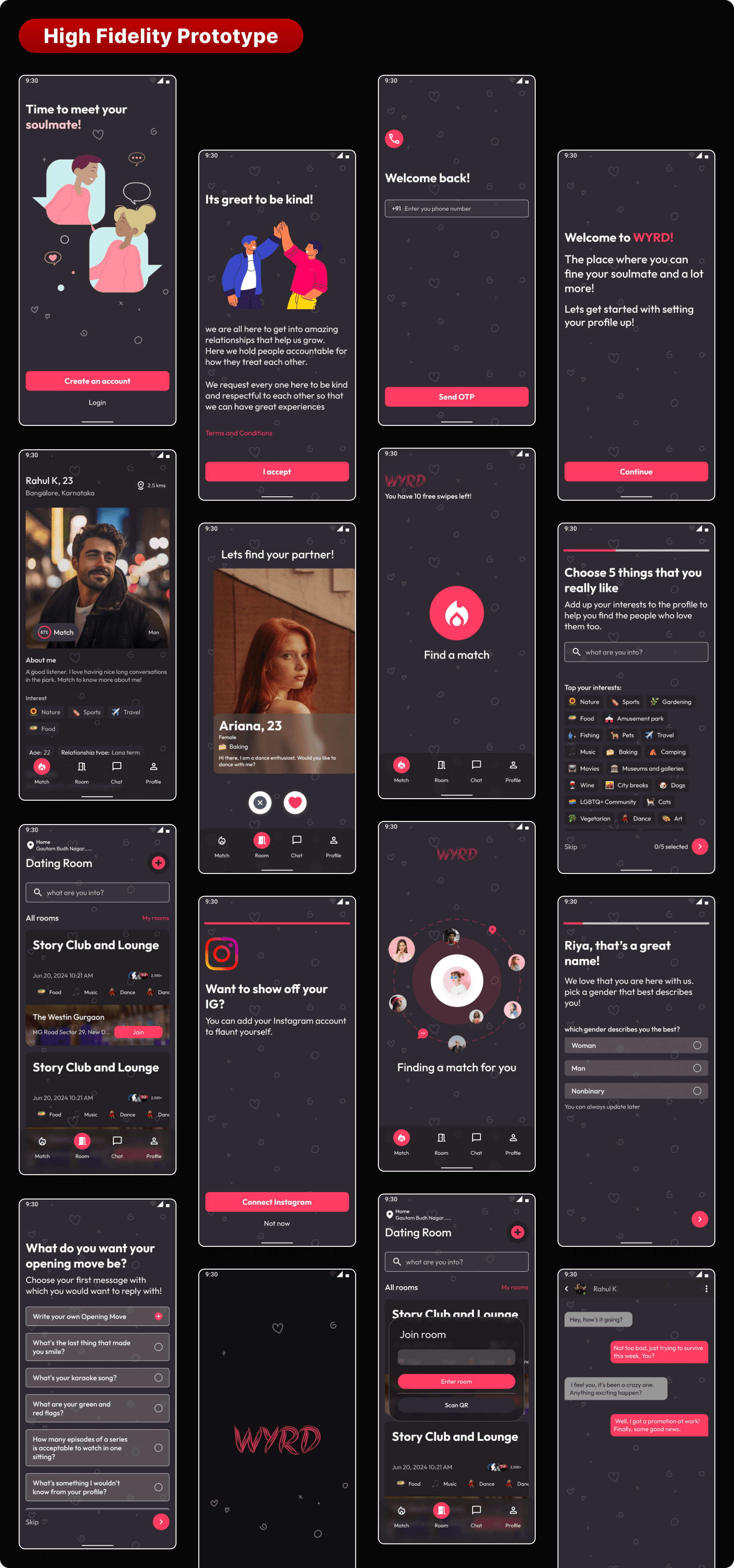
2. Wireframing
Created low-fidelity wireframes to map user flows
Iterated based on quick user feedback
3. UI Design
Bold, bright color palette for a youthful vibe
Rounded elements for a friendly tone
Minimal iconography to reduce visual clutter
4. Prototyping & Testing
Interactive prototype tested with 12 participants
Reduced onboarding steps from 7 to 4
Added instant conversation prompts after match
Our Solution
Streamlined Onboarding: Get started in under 60 seconds
Match Prioritization: Shows mutual matches first
Gamified Prompts: Fun icebreakers appear in chat after a match
Swipe + Scroll Hybrid: Keeps interactions fluid but intuitive
Impact & Outcomes
25% higher retention in early testing vs. standard dating app flows
40% faster onboarding completion rate
Positive feedback on “fun but simple” visual style
Reflection
This project highlighted the importance of removing friction without removing personality. The less you make users think, the more they engage.